


Did you know that improving your mobile site speed by just 100 milliseconds can boost retail conversion rates by 8.4%? In 2026, the mobile-first website design importance isn’t just a technical detail; it’s the foundation of your brand’s digital visibility. Since Google now indexes websites exclusively via its smartphone crawler, a site that fails on a phone is essentially invisible to search engines. You’ve probably felt the frustration of high bounce rates or the fear that your site might fall behind the latest algorithm updates. It’s a complex landscape to navigate, and many business owners feel the weight of trying to keep up with shifting standards like Interaction to Next Paint (INP).
We believe in a collaborative approach to solving these digital hurdles. This guide will show you why prioritizing mobile users is the most critical factor for search rankings, user trust, and sustainable growth in the modern economy. We’ll explore how custom architecture outperforms generic templates and why a focus on the mobile experience ensures better engagement across every device your customers use. You’ll discover how to transform your website into a high-performing asset that maximizes your ad spend and secures your place at the top of the search results.
Key Takeaways
- Understand why building for the smallest screen first is the only way to ensure your site remains visible and functional for the majority of your audience.
- Learn how Google’s shift to 100% mobile-first indexing means your site’s search performance depends entirely on its mobile-friendly architecture.
- Discover the mobile-first website design importance when it comes to passing Core Web Vital thresholds and reducing high bounce rates on smartphones.
- Identify the specific design patterns, like the thumb zone and optimized content hierarchy, that turn casual mobile visitors into loyal customers.
- Explore the benefits of custom development over generic templates for creating a fast, accessible, and high-converting experience across all devices.
What is Mobile-First Website Design and Why Does It Matter in 2026?
Mobile-first design is a strategic approach where the design process begins with the smallest screen and expands to larger viewports. It’s no longer just a technical preference or a nice-to-have feature. In 2026, the mobile-first website design importance is tied directly to your brand’s survival. Companies that treat mobile as a secondary concern find themselves struggling with high bounce rates and a noticeable drop in search visibility. We see this as a pivotal moment for businesses to align their technology with how people actually live.
This shift reflects a fundamental change in how your customers interact with the world. People don’t just browse; they seek immediate solutions while they’re on the move. When a user encounters a site that isn’t optimized for their current device, they leave. This bounce doesn’t just end a session. It signals to search engines that your content lacks relevance. The cost of ignoring these mobile users is high, often resulting in wasted marketing spend and a tarnished reputation in a competitive digital economy.
To better understand this concept, watch this helpful video:
The Evolution of Digital Consumption
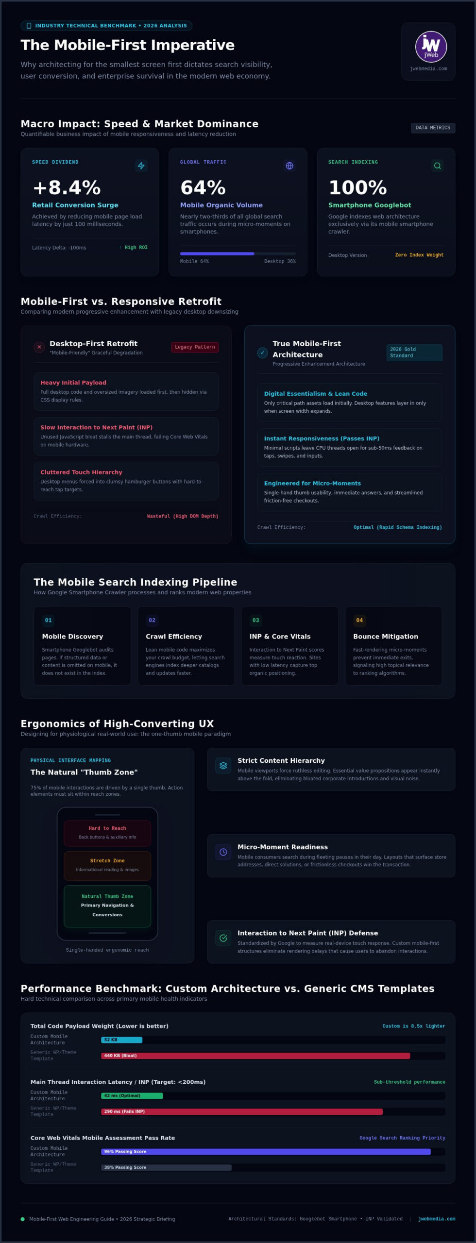
Recent data indicates that mobile devices now account for approximately 64% of all organic search traffic globally. This isn’t a temporary trend; it’s the standard for the modern digital economy. Consumers operate in “micro-moments,” making split-second decisions to buy, learn, or visit while they’re on the go. If your site can’t deliver the right information in those few seconds, you’re essentially handing your market share to a competitor. Desktop-centric brands are falling behind because they fail to meet users where they are: on their phones, looking for immediate answers.
Mobile-First vs. Mobile-Friendly: Clearing the Confusion
There’s a vital distinction between these two concepts that every business leader should understand. A “mobile-friendly” site often relies on responsive web design to shrink a large desktop layout down to fit a small screen. While this ensures visibility, it often leads to cluttered interfaces and slow load times that frustrate users. Mobile-first design, however, builds the core experience for the primary user from the ground up.
By starting with mobile constraints, designers are forced to make tough choices about hierarchy and functionality. This results in leaner code, faster interaction times, and a more focused user journey. It’s about building a steady hand for your brand in a fast-moving industry where every millisecond counts. Mobile-first design is a philosophy of digital essentialism that delivers the most value with the least amount of friction.
The SEO Impact: Why Google Prioritizes Mobile-First Architecture
Google doesn’t view your website the way you do on a 27-inch monitor. For years, the search giant has moved toward a model where the “Googlebot Smartphone” is the primary auditor of your digital presence. This means if your content, metadata, or structured schema exists only on your desktop layout and is omitted from the mobile version, it’s effectively invisible to the index. Adhering to Google’s mobile-first indexing best practices is the only way to ensure your site is even considered for a top-tier ranking in 2026.
The mobile-first website design importance goes beyond just being “crawled.” It’s about how efficiently your site uses its crawl budget. Lean, mobile-optimized code allows Google to index your pages faster and more accurately. When your architecture is built for mobile first, you remove the heavy scripts and redundant elements that often clog the pipes of search engine discovery. This efficiency builds a foundation of technical authority that supports every other marketing effort you undertake.
Mobile Performance and Search Visibility
Search authority in 2026 is heavily weighted by Core Web Vitals, specifically measured at the 75th percentile of real user loads. Your Largest Contentful Paint (LCP) must clock in under 2.5 seconds on a mobile connection to be considered “Good.” If your mobile site is slow, you won’t just rank lower; you’ll likely be filtered out of competitive search results entirely. Google prioritizes the user’s time above all else. Our guide on search engine optimization companies explains how this technical authority acts as a steady hand for your brand’s growth.
Lowering Ad Costs Through Mobile Optimization
Many business owners overlook the direct link between their website’s mobile architecture and their advertising expenses. Google Ads calculates your Quality Score based on the landing page experience. If your mobile site is clunky or slow, you’ll pay a higher cost-per-click to maintain the same position as a mobile-optimized competitor. By refining your mobile user experience, you naturally increase the ROI of your PPC management. Higher engagement metrics on mobile lead to better conversion rates from your ad spend, making every dollar work harder for your business.
We’ve found that a partnership-oriented approach to design often reveals these hidden opportunities for savings. If you’re concerned about how your current site affects your visibility, it might be time to explore a custom mobile-first strategy that aligns your technical execution with your business goals.
Mobile-First vs. Responsive Design: A 2026 Comparison
Responsive design often acts as a top-down strategy. You build the most complex version of a site first and then strip away or hide elements as the screen gets smaller. This retrofitting process frequently leaves behind “code bloat,” where a mobile device is forced to process styles and scripts that it never actually displays. Understanding the mobile-first website design importance means recognizing that phones are no longer the “second” screen. They are the baseline. By building the core experience for the primary user, you create a leaner, faster, and more resilient product.
While responsive design was a breakthrough for its time, it often struggles with the performance demands of 2026. A mobile-first approach ensures that your digital assets are optimized for the device that 64% of your audience is using. Instead of trying to shrink a desktop experience, you’re scaling an essential experience up. This shift in perspective allows for better focus on what truly matters to your customer, creating a steady hand for your brand’s digital presence.
Which Approach is Right for Your Business?
For legacy systems that need a quick update to maintain basic usability, a responsive retrofit might be a viable bridge. However, for organizations looking to lead their industry, a custom mobile-first build is the superior path. This methodology mirrors current federal standards for a digital-first user experience, which prioritize speed and accessibility above all else. While the initial planning for a custom build requires a deeper strategic partnership, the long-term value is clear. Mobile-first sites are easier to scale and maintain as new hardware emerges, ensuring your brand isn’t caught in a cycle of constant retrofitting.
Technical Efficiency and Load Times
Technical efficiency is the direct result of starting small. Mobile-first is a “bottom-up” approach to digital architecture. By focusing on essential assets first, you eliminate the risk of desktop-heavy images or unused JavaScript slowing down the mobile experience. This lean approach directly impacts user satisfaction and data usage, especially for customers on the move. When your site is built to be light and purposeful, it performs better on every device, from the smallest smartphone to the largest desktop monitor. The mobile-first website design importance is reflected in the seamless way these sites handle traffic spikes without compromising on speed or quality.
Core Elements of a High-Converting Mobile User Experience (UX)
Designing for mobile isn’t just about shrinking elements. It’s about understanding the physical environment where your customer lives. The mobile-first website design importance is rooted in the reality of how a user holds their device. Most people navigate with a single thumb, making the bottom arc of the screen the most valuable real estate for interaction. By placing primary calls-to-action and navigation triggers within this “thumb zone,” you reduce physical strain and make the browsing experience feel natural and intuitive.
Content hierarchy is equally vital on a small screen. You don’t have the luxury of white space that a desktop provides, so every pixel must earn its place. We prioritize the most critical information at the top, using progressive disclosure to hide secondary details until they’re needed. This keeps the interface uncluttered and helps the user focus on the task at hand. Visual speed also plays a massive role in conversion. By using modern image formats like AVIF or WebP and implementing lazy loading, we ensure your site feels instantaneous, even on slower mobile networks.
The Psychology of Mobile Trust
Trust is built in milliseconds. When a mobile site feels clunky or difficult to navigate, users subconsciously associate that friction with your brand’s reliability. Professional design validates your credibility by eliminating the “Fat Finger” problem. We adhere to industry standards, such as Apple’s 44×44 point or Google’s 48×48 pixel recommendations for minimum touch targets, to ensure every click is intentional. To see practical implementations of clean, conversion-focused mobile layouts, reviewing the showcase gallery from Dulyfixed Small Business Solutions demonstrates how deliberate design choices reduce friction. You can learn more about the importance of UX in website redesign for conversions in our detailed guide on custom partnerships.
Streamlining the Conversion Path
A high-converting mobile site removes every possible barrier between the user and their goal. This includes one-click calling buttons and simplified checkout processes that integrate with mobile wallets. Sticky CTAs, which remain visible as the user scrolls, keep the next step of the journey always within reach. These small adjustments lead to significantly higher engagement rates from your mobile audience. If you’re ready to see how these elements can transform your digital presence, partner with us for a custom mobile-first build that prioritizes your audience’s needs.
Partnering with jWeb Media for Custom Mobile-First Solutions
At jWeb Media, we understand that your digital presence is more than a collection of pages; it’s the primary touchpoint for your national audience. Transitioning to a mobile-first architecture isn’t just a technical upgrade. It’s a strategic shift that requires a steady hand and a deep commitment to your business goals. We position ourselves as a dedicated partner, bridging the gap between complex technical requirements and the practical needs of your customers. The mobile-first website design importance lies in its ability to serve as a high-performance foundation for all your marketing efforts, from organic search to paid campaigns.
While many competitors suggest that a simple template is enough, we believe that custom architecture is the only way to win in competitive markets. Templates often carry legacy code and unnecessary features that lead to the “code bloat” we discussed earlier. Our approach focuses on building lean, purposeful sites using custom WordPress or Shopify development. By integrating design with SEO and content strategy from the start, we ensure that every pixel supports your visibility. This full-spectrum approach is most effective when managed through monthly marketing retainers, allowing us to refine your strategy as user behavior evolves in 2026.
A Methodology Built on Results
We’ve spent over two decades refining a process that moves businesses away from desktop-heavy legacy systems and into positions of mobile leadership. Our methodology is rooted in data-driven design and a thorough analysis of how your specific audience interacts with their devices. We don’t guess what your users want; we use interaction data to inform every design choice. This ensures that your custom build isn’t just visually appealing but acts as a functional tool for growth. Custom development provides the flexibility needed to stay ahead of algorithm updates and maintain your digital authority on a national scale.
Ready to Elevate Your Mobile Presence?
Every successful project begins with a strategic discovery phase. This is where we align our technical execution with your specific revenue targets and brand identity. We act as a strategic champion for your business, providing the transparency and expertise needed to navigate the fast-moving digital landscape. Our team is ready to help you transform your website into a high-converting asset that meets the rigorous standards of today’s mobile-first world. If you’re ready to see how a dedicated partnership can drive your success, contact jWeb Media for a custom website consultation today.
Securing Your Digital Future with Mobile-First Strategy
The shift toward a mobile-centric economy is no longer a trend; it’s the definitive standard for 2026. By prioritizing the mobile experience, you ensure your brand remains visible to Google’s smartphone-only indexing and accessible to the majority of your audience. We’ve explored how custom architecture outperforms generic templates by reducing code bloat and improving the ROI of your digital marketing efforts. Understanding the mobile-first website design importance is the first step toward building a resilient national brand that thrives on every screen.
As your dedicated partner, jWeb Media brings over 20 years of custom design expertise to help you navigate these technical complexities. Our full-service approach integrates SEO, PPC, and social media management into a cohesive strategy focused on your long-term success. We’re here to act as a steady hand, ensuring your technology always aligns with your business goals. It’s time to transform your digital presence into a high-performing asset that connects with your users wherever they are.
Build a Future-Proof Mobile Experience with jWeb Media
Your growth is our priority, and we’re ready to help you lead your industry with confidence.
Frequently Asked Questions
Does mobile-first design mean my website will look bad on a desktop?
Mobile-first design doesn’t compromise the desktop experience; it enhances it by ensuring the core message is clear. Once the essential elements are established for small screens, we layer on progressive enhancements for larger viewports. This results in a desktop site that is cleaner and more focused. Your brand maintains a professional look across all devices while ensuring that the most critical functions are accessible to every user, regardless of their screen size.
How does mobile-first design affect my search engine rankings?
Google now uses mobile-first indexing exclusively, meaning its bot crawls your site from the perspective of a smartphone user. If your mobile layout lacks the content or structured data found on your desktop version, Google won’t index it. The mobile-first website design importance is reflected in how search engines calculate your authority based on mobile performance metrics like Core Web Vitals. A well-structured mobile site is the foundation for higher organic search visibility.
Can I turn my existing website into a mobile-first site without a full redesign?
Transitioning an existing site to a mobile-first architecture typically requires a comprehensive redesign rather than a simple patch. Since mobile-first is a “bottom-up” philosophy, it involves restructuring your code and content hierarchy from the ground up. Retrofitting an old desktop-centric site often leads to technical conflicts and slow load times. A fresh start allows us to build a lean, high-performing asset that serves your long-term business goals without the baggage of legacy code.
What is the difference between mobile-first and responsive web design?
Mobile-first is a design strategy, while responsive design is the technical tool used to execute it. Responsive design ensures a layout fluidly adjusts to any screen size, but mobile-first dictates that the planning and coding begin with the smartphone experience. By prioritizing mobile constraints first, we eliminate the unnecessary code bloat often found in sites that were originally built for desktop and then shrunken down to fit smaller screens.
Why is page speed so much more important for mobile-first sites?
Mobile users often browse on less stable networks, making every kilobyte of data critical for retention. Google’s 2026 standards prioritize metrics like Largest Contentful Paint (LCP) and Interaction to Next Paint (INP), which are measured primarily on mobile devices. Fast load times reduce bounce rates and improve user trust. When your site is built with a mobile-first approach, it utilizes lean assets that ensure your content appears almost instantaneously for every visitor.
How much does a custom mobile-first website redesign cost?
The cost of a custom mobile-first website redesign depends on the complexity of your project and your specific business goals. We utilize project-based website development fees that cover everything from the initial discovery phase to UI/UX design and final coding. Every build is unique to the client’s needs, whether it’s a custom WordPress site or a complex Shopify store. We focus on creating a high-value asset that provides a measurable return on your investment.
Is mobile-first design important for B2B companies?
Mobile-first design is essential for B2B companies because decision-makers frequently conduct initial research on their smartphones. Whether they’re at a trade show or commuting, your prospects expect a seamless experience. If your site is difficult to navigate on mobile, you risk losing credibility before the first conversation even happens. Providing a fast, accessible mobile experience helps build the trust necessary to move high-value B2B leads through your conversion funnel.
What are the biggest mistakes businesses make with mobile design?
One of the most common errors is treating mobile as an afterthought by simply hiding desktop elements rather than optimizing them. Businesses also frequently fail to provide adequate spacing for touch targets, leading to the frustration of misclicks. Other mistakes include using heavy, unoptimized images and neglecting the mobile-first website design importance regarding simplified forms. Ensuring that your conversion path is clear and frictionless is vital for maintaining high engagement.